Red and Blue Composition
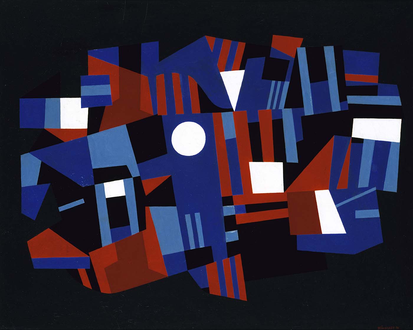
Ad Reinhardt rejected any associations between his work and the world around him, believing that the paintings should express only themselves and not attempt to imitate nature. Here, he used vibrant shades of red and blue against a dark background to create an image that jumps forward from the surface. The pure white shapes appear luminous, as if a bright light is shining through the canvas. We notice the red, white, and blue shapes immediately, but the black background also creates a geometric pattern in the spaces between the colors
“An emphasis on geometry is an emphasis on the ‘known,’ on order and knowledge.” Reinhardt, Studio 35 Discussion, April 1950, quoted in Lippard, Ad Reinhardt, 198
- 19
- Other objects by this creator in this institution
- 62
- Objects by this creator in other institutions